
Here are the markets that are catching Doc’s eye

To wrap up the week we cover gold, bonds and the conventional markets.
Click download link to listen on this device: Download Show
(cough)
2 views of 30-year
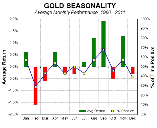
http://www.seasonalcharts.com/classics_gold.html
http://www.marketoracle.co.uk/images/2014/Jun/gold-9-10.png
Original, what I would like to do is to be able to put charts up and then dialogue since just putting charts up with lines etc. doesn’t tell the whole picture in my view. It takes dialogue and questions and answers with nuances that the charts don’t show. Cory and I just finished talking about this and he’s going to do some research and we’ll try to develop a system where we can get you and other chartists and people that are interested in dialoguing in real time. In our next newsletter, charts have been put up of a gold company we’re intrigued by along with comments on the monthly, weekly, and daily charts. Give us some time and hopefully, we’ll come up with something where we can comment on charts and the variables. If I just put up charts, I would then have to type along with them long winded explanations about why I’m thinking what I’m thinking since it goes beyond the normal variables and morphs into nuances based on looking at thousands of these things. Does that make any sense to you? I would just like to reiterate we’re trying to come up with something where we can interact easily with charts and dialogue. That way we all benefit.
Thanks for taking the time Doc to reply, the chart below of the US$ doesn’t get any simpler and requires 0 effort, you can write your thoughts as I did on the chart. Unless the listeners are complete morons what you say in your audio they can apply to the charts you highlight, no?
I’m a chart trader, its how I make my living, I think I’m at the wrong web-site as I’m looking for a site that doesn’t care about grammar or spelling just making money, any suggestions?
Tried google searching making money off stock charts for illiterates but came up empty, far too many over educated so called experts who have not called any market correct in years with sheeple followers for my liking here, lol
Enjoy the long weekend Doc……its been a blast, good luck to you!
Unfortunately, I’m not a day trader although I should probably be one since I do pretty well on short term moves. I’ll usually hold a stock for a minimum of 2 weeks and if it moves against me technically, I’ll exit my position right away. I try to build long term positions over time that I will hold for months when the stock is washed out. That’s why I love the Pm stocks right now. That’s why I’m afraid I can’t give you any good suggestions. I do know some day traders and I do know they use certain platforms. When I see them again, I’ll try and remember to ask them what they use.
If I was feeling optimistic, I am looking at the gold market and wondering if it is a bit like 1999-2001, when nothing happened for 2+ years, the price just went from a very slow downtrend to almost flat, y=tested the lows a bit later and then into a very slow uptrend. i didn’t get interested in the gold market action until about May 2001 and by that September it was hardly up. by Christmas 2001 it was imperceptibly up, maybe a few dollars above September’s values. Gold spent so much time between $270 and about $279 it was unreal.
I hope gold trends down over the Summer.
First zone of support/resistance coming up on the Euro$ chart
http://stockcharts.com/h-sc/ui?s=$XEU&p=D&yr=0&mn=3&dy=0&id=p63257522144&a=409350792&listNum=1
US$ closing week out strong, you can’t post these charts Doc?
http://stockcharts.com/h-sc/ui?s=%24USD&p=D&yr=0&mn=3&dy=0&id=p89516841462&listNum=1&a=409351845
I’ll put up a chart I’m looking at then explain a number of things about how I look at the chart based on factors other then usually looked at. Hopefully, going forward, we then can talk about it in a forum where we can throw around ideas that go just beyond all the variables of charting that normally aren’t talked about.
We use almost identical indicators; One difference is I use MFI versus RSI. Seems to work a little better (from ahistorical perspective) for my individual stocks.
Recently, I have decided to use TA to start position in RBY – as a method of buying share-blocks on pullbacks (plus it is FUN). I have added Keltner Channels (KELT) to my BB overlay to see if this makes a difference on the RBY buys.
No better time to learn TA and hone ones skills, than the beginning of a bull market, eh?
Brian, RBY is at the top of my list to purchase. I’m just waiting for what I “hope” is the best entry point—-not investment advice. In the coming newsletter, Cory and I will put out an interesting gold company from a fundamental and technical basis.
Brian, would you like me to pull up a chart of RBY and outline some technicals and tell you where I’m looking at a potential entry point?
That would make my weekend, DOC
😉
Brian, I just put the weekly chart of RBY up. The RSI and MACD look pretty neutral but the +DI ADX line is trending down—-the odds are that it will continue and ultimately the -DI ADX line will take over. Strength is not a main player for either lines so there doesn’t appear to be a major move one way or another. What I find interesting is the line I drew on the chart itself. I did this to take a position of when to buy based on Gary’s cycle theory. If you remember, his intermediate cycles generally run from 20-25 weeks. We currently are in week 10 and will start week 11—based on his chart theory, this intermediate cycle’s price should end below the line I drew and with anywhere from 10 to 15 weeks out that tells me it’ll probably be below the current price if you carry that line out.
I’ll put the monthly chart on my next post since for some reason I can’t upload both at the same time.
I decided to buy a 10% position in RBY recently (@ US$1.08) just to get it started.
I’ve done all of my DD and FA. Their website is excellent for finding important data.
I was secretly disappointed with the 8 g/t, but I think they are being conservative.
Thanks, DOC. I’ll start to look at these. ~ Brian
I focus way too much on the Daily charts.
Looking at the weekly (and monthly) is all part of my education.
http://stockcharts.com/h-sc/ui?s=RBY&p=M&b=5&g=0&id=p68895824935&a=409363669&listNum=2
Brian, the monthly chart shows the lower bollinger band is traversing laterally instead of down. It shows me the best time to purchase would be at about $.75. The ADX is pretty neutral and the only positive is the fact that the -DI is moving down directionally. The momentum indicators are much more positive in that they are moving up toward neutral but have a ways to get there.
Saudi Arabia and middle east Destabilization continues !iiiii Don’t worry keep looking fake MARKETS AND CORRUPT NUMBERS !!!!!!! https://www.youtube.com/watch?v=WR4WnIOQczw
Original, above is the proxy for the US dollar index—-the UUP. There are things on this daily chart that I look at that aren’t noted in books on TA that I’ve noticed over time. One has to remember that I look at odds a lot when the technicals aren’t necessarily signaling a move one way or another. Look at the circles on the chart per se and note I circled two areas where you have 2 gaps. What I’ve noticed from many charts in the past is that when you get gaps this close together even though one appears as a breakaway gap the odds are you will fill those gaps sooner then later. Also, you have the 50 day MA moving down to intersect pricing. Once again, the odds are that with a 50 day MA moving down you often the first time will abut up against it and then move down. Of course, that’s not always true but in most cases it is with some of the other things noted on this particular chart. Plus, you’re about to abut against the upper bollinger band. Now moving down to RSI notice the area where I circled the movement down into oversold area. If you look back over months, you’ll notice how we haven’t hit oversold for months. What I’ve noticed in most charts is that when this happens, it’s a warning sign that something has finally changed and the odds are you don’t just take off to the upside to establish another high right away and that there is work to be done yet. The RSI does appear to say you may yet move a little higher to just touch the overbought area. Let’s then look at the MACD. If you notice the circled area; once again in months it has broken below what I call the neutral 0 line. The trend has been compromised. Also the sharpness of the 12 day MA of the MACD as it leads the 26 day MA often results in a quick but not a long lasting new move to much higher levels. More often then not, when you’ve compromised the 0 line you’ll move up and then move one more time with the 12 and 26 day MAs to challenge the previous lows. Then at that time you can potentially start your next bull movement up. Does it always happen this way —–no, however, these are what I call the nuances of charting which aren’t talked about in any books I’ve ever read but over time of looking at tons of charts, you start to see enough things repetitively to ascertain the odds of that happening again. I hope this has been helpful in order for you to understand why I’ll take positions that most chartists won’t —-whenever, charts aren’t clear; if you look at some of the nuances, you’ll on an odds basis have a chance at ascertain results. Is it still guessing sometimes? Certainly, but when the odds are in your favor, it decreases the amount of guessing.
DOC
Simulating your new venue by using Apple Text-Speech on your post and opening your chart in a new window.
It. Just. Works.
Brian
Thanks for the info. As I noted above, RBY is on the top of my list to purchase. Would you like me to put up the chart and outline my thinking about an entry point?
What you think off Silvercorp metals ( SVM ) 1,50 CAD ?
DOC ? is AL ok ?
YES, please ! ! !
Interesting commercial COT report for last week. Silver net shorts increased almost 11000 net shorts while gold shorts increased almost 33,000 net shorts—THIS IS NOT A GOOD REPORT.
The COT report …
https://www.dropbox.com/s/19l0u5s22uiosyu/COT%2022052015.jpg?dl=0
As you can see in the chart below the Commercial activity is often in the OPPOSITE direction of the markets trends. This is because they are actively buying when the market is going down and actively selling when the market is going up.
Gabriel, what bothers me about this report is that gold is trending down and the shorts are piling on although they compute the report as of Tuesday when gold dropped significantly. One thing I don’t know is if the data is gathered at the end of Tuesday or at the end of Monday. If at the end of the Monday, then the drop since Tuesday hasn’t been factored in .
I just found out the data is collected at the end of trading on Tuesdays.
Thank’s DOC ? And AL ? https://www.youtube.com/watch?v=6DpqiArsJG8
BIRD ? CORY ? DOC ? (((((((( AL )))))))))))) ???????????? https://www.youtube.com/watch?v=CtUuOIXLawg
The cloud Microsoft is more control freak control ! Day will take all we have ! Microsoft stock will go UP ! SLAVES !
Microsoft ! https://www.youtube.com/watch?v=GvLormHVgCM
YOU WILL LOVE THE NEW ROMEN COLOSSEUM ! https://www.youtube.com/watch?v=Xp7VhEy4GHI
Investors are too bullish on the dollar. It is still in a downtrend. It should head toward the 200 day as it has not been there in a year or so. The 200 day is rising sharply. Investors have been too bearish on oil and it is headed up toward 65+. The sharp move up looks like a new bull market to me although I am no expert. I have some nice gains on Apple now buying every $2 down on the drop and that has helped my huge oil position which is still at a loss. Just sold my HP shares the other day and they just shot up over $2.
Abbie Gilbert takes down Peter Skiff….
Why Peter Skiff is still wrong about gold
http://www.marketwatch.com/story/why-peter-schiff-is-still-wrong-about-gold-for-now-2015-05-21
Doc, put up a stockchart of what you are seeing or are you just guessing?
Put up a seasonal chart of gold, June, July, Aug very active swings down-up-down-up