
Gold, Silver, Equities: Megaphone Patterns

Examine the 20 year log scale chart of monthly gold. I have drawn lines connecting highs and lows. The result is an expanding channel or megaphone pattern. The increasing prices are exponential (log scale chart) because of exponential increases in debt, money supply, and Keynesian craziness, although I have no graph to prove the latter.

Examine log scale charts for silver, crude oil, the Dow Transports, and the S&P 500 Index. You can see similar exponential increases and megaphone patterns of much higher highs and deeper lows.


I have circled important chart lows and highs, and related lows and highs in the MACD and TDI at the bottom of the charts. I have also added dashed lines indicating my estimate of the future direction of prices.
WHEN? Ask the high frequency traders and central bankers, since they exert substantial influences on prices, but market forces cannot be repressed forever.
THE BIG PICTURE AS I SEE IT:
- Prices for gold, silver, crude oil, other commodities, and equities are exponentially increasing in the long term.
- Debt and money supply have increased exponentially and have driven prices much higher. Equities benefit for years and then commodity prices benefit for years.
- Equities have enjoyed a very long bull market. It may have topped.
- Bonds have been in a 30+ year bull market. When some European yields go negative past five years duration, it is time to anticipate the death of the bond bull.
- Central banks want to levitate bonds, levitate equities, and repress commodity prices. Clearly they have temporarily succeeded. Their ability to manipulate prices may survive a while longer, but commodity prices will eventually follow the increasing debt and money supply. Debt and money supply will increase, so in the long term commodity prices will also increase, unless there is a violent reset.
- Higher gold, silver, and crude oil prices are coming. Lower prices for bonds and equities are coming.
Read:
Craig Hemke: Another Comex Oddity
Robert McHugh: China’s stock Market Crash Likely Headed West
George Smith: Why Central Banking Persists
Charles Hugh Smith: Diminishing Returns
Gary Christenson
The Deviant Investor
When gold price hit 1900 back in 2011 , It caused a lot ofjunior and mid cap gold miners to expand production . Plus the co production of gold in copper mines. So i dont think we are in for a gold price lift for some months or more. I think we muddle thru for several months and see lower gold prices and gradual up trend in common stocks continue . Logic does not explain current events in the political world or the financial world . S
Perhaps human logic does not, Russell. How about spiritual logic?
I see the MACDaddy is crossing. Good $ign. 🙂
These charts are extremely subjective.
on the Dow and S&P500 charts, if you deaw the upper megaphone line through the first two highs, then the price has already broken out well above the pattern. I don’t know if this happens that often because the megaphone is usually a bearish pattern as I understand it.
However a much bigger and longer megaphone pattern is the Dow:Gold ratio – 85 years in the making.
Good luck I say…TA is useless without fundamental analyses and I mean GDP #s and all the other king indicators that one needs on all the others combined.
I know 2 maybe 3 guys on the planet that can do it well on planet earth. I can make a pretty dang good call but my guys blow me away…
I heard the big boyz last years forecast a year ago and had a giggle (Sprott is one). WE should be at new highs by now right?!…I watched the pumping all the way down. Did anyone shout “LOOK OUT BELOW” 2011-12-13….We did..
The last bear was 20 years and people held on and lost their shirts but not without its rally’s to keep sucking people in. BTW the gold chart is not a bullish formation at all but it is oversold…I warned Nov 2014 that we were not heading into a new bull but down….GOOD LUCK!
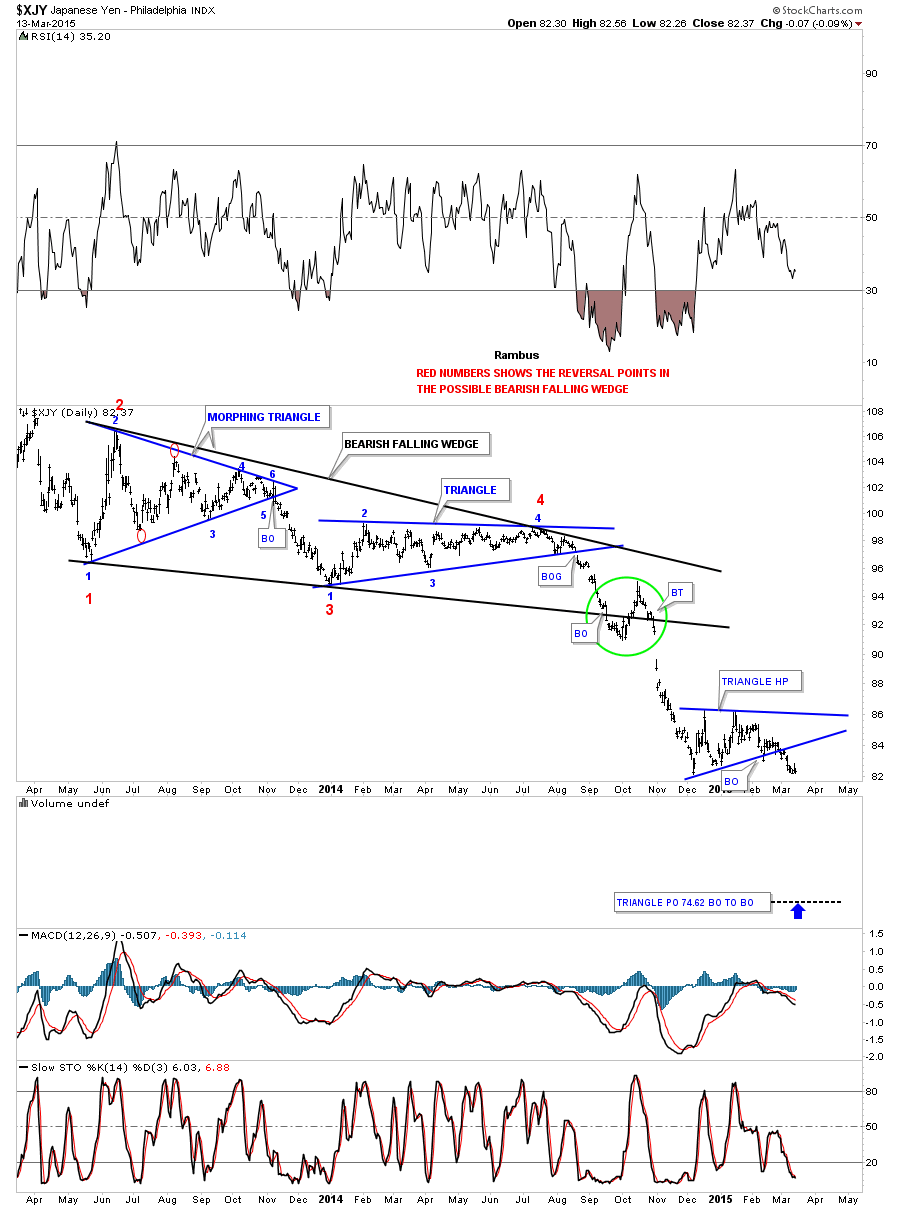
I want to know from Doc if gold is going to follow the Yen into a big fall out of its falling wedge formation. Yen did it last September. Gold is at support right now.
http://1000gold.blogspot.co.uk/2015/07/falling-wedge-of-gold-is-similar-to.html
Gold looks si similar to the Yen in Sept 2014 before the last Yen fall:
Here is the megaphone on the Dow:Gold ratio:
http://1000gold.blogspot.co.uk/2008/06/mega-move-from-dowgold-megaphone-2008.html
Better chart is here: Dow:gold megaphone could really break down only in a hyperinflation:
http://1000gold.blogspot.co.uk/search?q=dow+gold+ration+to+zero
and that is not happening anytime very soon, not in the US dollar anyway.
DO NOT FORGET TO READ…………………..Another Comex Oddity (see above)by Craig Hemke………