

So-called “1% days” in the S&P 500 – in both directions – became commonplace. Every headline from Europe had the ability to jack e-mini S&P futures up or down to a major gap opening. Volatility was elevated for a long stretch of time and heightened correlations across stocks and sectors were breaking records.
That’s when the Federal Reserve stepped in with one of the largest stimulus schemes of all-time. An open-ended delivery of $80 billion a month going straight into the bond market and indirectly into the banking system. This QE program did several things very well:
a) drove expanded multiples on stock prices
b) ignited a historic buyback binge
c) moved a ton of investor capital flows into equity / corporate bond mutual funds
d) suppressed volatility
e) changed investor psychology toward a buy-n-hold orientation, puffing up Vanguard’s index fund AUM while giving rise to the robo-advisor industry
f) made sellers of anything look ridiculous
The dips were all automatically buyable and the drawdowns all led to v-shaped recoveries measured in days, rather than weeks toward the end. I called this the Relentless Bid Era and I was sad to see it go right around the time QE was winding down last winter.
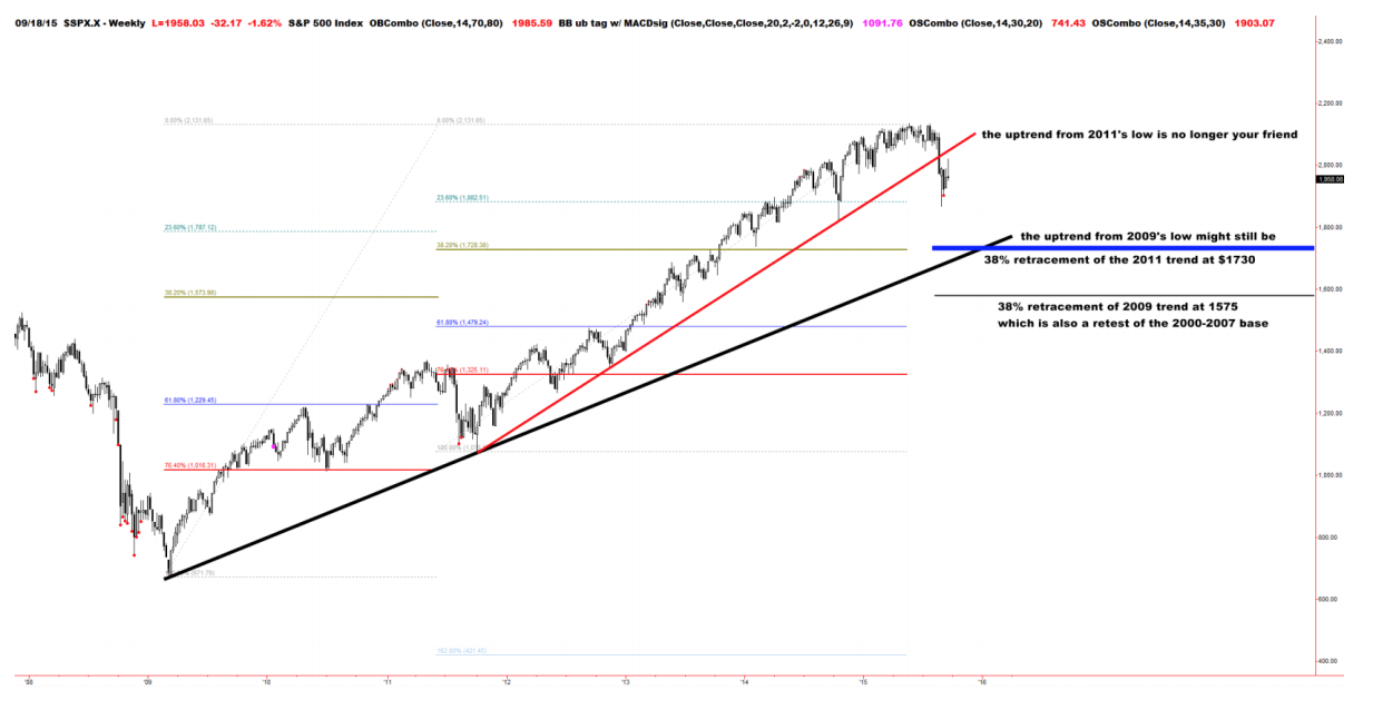
With QE concluded at the end of 2014, stocks ended up spending most of 2015 in a sort of listless haze, with the major averages repeatedly failing at new highs. And now, a major trendline dating back to the launch of 2011’s QE announcement has been broken.
Here’s Frank Longman, CMT, of Brean Capital:
For most of us, there are two trends that matter. There’s the uptrend that began at the trough of the last 20% correction in October 2011. That one is broken. The break solidifies the notion that we’re in the midst of a pretty serious correction for the first time since 2011 and it has us believing that the current 9 percent drawdown from the highs is not likely to be the bottom…
If a 9% drawdown isn’t “enough” given the break of that trend, what is? Logic would suggest that a test, but not necessarily a breach of the next larger trend might be enough. The next larger trend would be the uptrend that began at the 2009 low. It passes through the 1700’s in October.
Josh here – In Longman’s chart below, the red line represents that trendline from October 2011, what we’ll call the QE Uptrend, which has now been violated definitively. The black trendline rising below it is the uptrend from the March 2009 ultimate low. There’s a long way to go if that is the new support.
 Source:
The Trend From 2011’s Low is No Longer Your Friend; Correction vs. Trend Change
Brean Capital – September 21st, 2015
Brean Capital, AKA, Captain Obvious..