
These Four Charts Say A Lot About The Stock Market

As the title states this post outlines 4 charts that taken as a whole provide some valuable insight on the risk tolerance in the markets. The takeaway for me is that the confidence in the market is clearly strong but is testing many resistance levels. If we continue upward and see a breakout, especially in the retail sector and materials (when compared to treasuries) the US markets will continue to move up.
Click here to visit the Ciovacco Capital website where this was first posted.
…
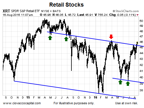
Retail Trying To Break Out
The consumer is often referred to as the lifeblood of the U.S. economy. Even though retail is in a state of Amazon-flux, the sector is trying to clear an area that has previously been dominated by sellers.
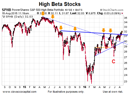
High Beta Clearing Hurdles
The High Beta ETF (SPHB) carries dominant weights in financials (XLF), energy (XLE), and technology (XLK). As shown in the chart below, this economically-sensitive investment is trying to break above an area that has acted as resistance for a year. As recently as June 28 (point C below), SPHB looked to be on the ropes.
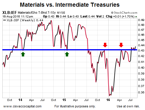
Materials: One Hurdle Down
When investors are more confident about future market outcomes, they tend to prefer economically-sensitive materials (XLB) over defensive-oriented intermediate-term Treasury bonds (IEF). As shown in the chart below, the confident vs. concerned ratio is trying to break out in a confident manner.
Materials: One Hurdle To Go
Materials have some work to do relative to longer-term Treasury bonds (TLT). Both XLB and TLT are in positive trends when viewed in isolation. The ratio below helps us monitor the market’s tolerance for risk; it also gives us some insight into longer-term interest rate expectations. The market believes one more Fed hike could be coming in the next six months, but has doubts about a third hike ever seeing the light of day.
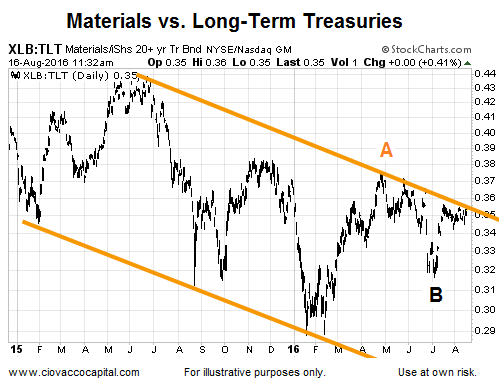
While risk tolerance has picked up since the June 28 Brexit reversal, the last time materials made a new high relative to long-term bonds was back in late April (point A above); the last new low was made in June (point B).
How Can We Use All This?
The charts above show an increasing tolerance for risk, which improves the odds of the S&P 500’s recent bullish break to new highs being sustainable. These charts can also be used to monitor any shifts in investor expectations about the markets, economy, and central bank policy.
It should also be noted the recent bullish pops higher on the charts of XRT (retail), SPHB (high beta), and XLB (materials) vs. IEF (bonds) are still near areas of prior resistance, meaning those breakouts still need to prove they can be sustained. The longer a breakout holds the more meaningful it becomes. The current bullish slant of the charts above aligns with the recent comparison of the market peaks in 2000 and 2007 to the present day.
I wonder how long people will keep looking at charts. This is a con game at best, and someone is going to pull the rug underneath your feet. And when it happens everyone will say, “Nobody! could see it coming”
Same old story every time.
True, but you can sit a long time, gaining nothing while waiting for the rug to be pulled.
Just when everything looks great it can be time for a turnaround. September is almost here.