The chart below was sent to me by our friend Peter Boockvar as well as posted on his site BoockReport.com as part of a larger posting.
The US Citi Surprise Index is a measure of US economic data either exceeding or missing expectations. This measure can swing wildly but as you can see in the chart below has been fairly well correlated to the S&P over the past two years. This could be predicting a short term pullback for the markets or a general uptick in positive economic data very shortly. We already saw better than expected ADP job numbers today but let’s see what follows the rest of the week.
Here’s the chart and what Peter had to say…
We enter the last two days of the week with really important US economic data with jobless claims, the ADP and payroll reports, the ISM manufacturing index and auto sales. We do so with the US Citi Surprise index sitting at just above the lowest level since February 2016 and here is an overlay of it vs the S&P 500 over the past two years. Notice any disconnect?


Alternatively here is an article from the Financial Times posted on May 8th that tries to dismiss any worries investors would have from the chart above…
Points for honesty from Citi, with our emphasis:
While the collapse of the domestic Citi Economic Surprise Index has investors worried, there are still many reasons to push against the skepticism in economic reflation.
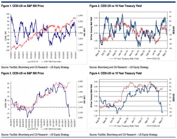
The investment community arguably is supposed to make educated decisions when it comes to buying securities, but that sensible approach sometimes misses the mark when people opine on issues in which they have little or no knowledge. The Citi Economic Surprise Index is a perfect example of unique proprietary design which has almost no bearing on those who discuss it. The models were built by quantitative analysts in Citi’s FX unit and were structured for currency trading. Thus, if the CESI wiggles one way or another, investors get signals to buy the yen or the euro or the loonie, etc. It was not meant to be used for stock prices or for Treasuries, but coincident rather than causal relationships are relied on even if they have no consistency whatsoever. For example, Figures 1 and 2 show the relationship between the S&P 500 and the 10-year yield versus the CESI over the past five years. If one looks at just nine months, the gap looks worrisome for stocks (see Figure 3) but not necessarily for 10-year Treasuries (shown in Figure 4). Unfortunately, we find that the narrative becomes the dominant feature, not the historical trading evidence.
It’s not a bad fit, but it’s not something to look at in isolation:

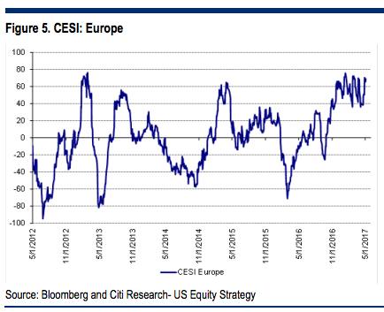
As we have mentioned here before, the index is also mean reverting — that means it’s designed to come back in as it has a natural pull towards zero. So, as Citi say of the US Surprise Index charted above, since “it was near a five-year high six-to-seven weeks ago and was vulnerable to a pullback.” That’s at least one reason to not get too excited about said pullback. It’s also something to keep in mind when considering the path of the European edition: