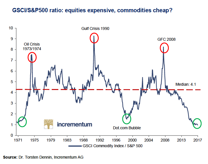
Here is an interesting chart published by our friend Ronni Stoeferle from Incrementum AG. I outlined this chart back in January when I presented at the Cambridge House show and since that time this chart has moved further down. Essentially what it outlines is the overall value of commodity equities, as judged by the GSCI commodity index (click here for a rundown of this index), compared to the overall value of the S&P.
These are the type of charts that illustrate just how extreme things can get in the markets. While not a perfect timing indicator it does show that this ratio will need to regress back tot he mean. Whether that means commodities go on a huge run or the S&P experiences a major pullback, when you reach these multi-decade lows it won’t stay here forever.
Here is a quote from Incrementum and the chart…
“In relation to the S&P500, the GSCI commodity index is currently trading at the lowest level in 50 years. Also, the ratio sits significantly below the long-term median of 4.1. Following the notion of mean reversion, we should be seeing attractive investment opportunities.”