There is an ongoing debate about whether the gold to silver ratio (on a absolute basis when compared to historical averages) is useful for investors to consider when assessing the broad metals markets. However I do find value in looking at the charts and looking for changes in direction. This is what the chart and blurb below from our friend Chris Kimble of Kimble Charting Solutions is outlining. A potential double top could be occurring which would be bullish metals!
Click here to visit Chris’s site for more great, straight forward technical commentary.
…
Gold & Silver Ratio could be creating very bullish pattern!
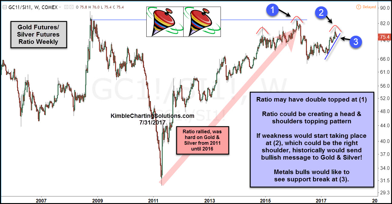
Below looks at the Gold Futures/Silver Futures ratio over the past decade. The ratio bottomed in 2011 and started moving higher, sending a bearish message to both Gold & Silver. The ratio has rallied since the 2011 lows, where it could be creating a “topping pattern” over the past couple of years.
CLICK ON CHART TO ENLARGE
The long-term trend in the ratio remains up since 2011, which is hard on metals. Over the past couple of years, the ratio could be forming a head & shoulders topping pattern, with the head taking place at the highs back in 2008. The short-term rally of late, could have completed the right shoulder, of this pattern at (2).
If this would happen to be a topping pattern, what it does at (3) becomes very important for both Gold & Silver bulls. Metals bulls want to see this ratio break support at (3) and head lower. If the ratio would break support, historically Gold, Silver and Miners would attract buyers.
If staying on top of pattern in Gold, Silver, Copper and Miners is of interest to you, we would be honored if you were a Premium or Metals members, as charts like this are shared each week with these members.