
Dana Lyons – 2017 Charts Of The Year

This is a great recap of the most important charts in 2017 to Dana Lyons. Be sure to follow the links (click the headline of the chart posting) to read the full post when Dana published it on his site. I hope you all enjoy.
…
As 2017 draws to a close, we again take a look back – in chart form – at the noteworthy events and conditions that defined the year in the financial markets. These charts aren’t necessarily our most popular ones. Consider these our “editor’s picks”. The charts range from those that had the most impact on the markets in 2017 to those that may have the most impact on 2018. They don’t necessarily include after-shots of the big movers of the year. However, you will see “before” shots of many of the big movers. After all, we are money managers and the objective behind these charts is to identify potentially profitable moves before they happen. Finally, there is our chart of the year for 2017. We would love to know which charts you feel should have been included so feel free to send along your feedback. We thank you again very much for your viewership this year and wish you all a very healthy and prosperous 2018!
So, without further ado, here are our 2017 Charts Of The Year (in chronological order – click on the titles to visit the respective posts):
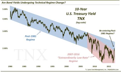
Is Bond Market Entering A New Regime? – January 11
The early-2017 rise in bond yields lifted 10-Year Yields out of the post-2007 “extraordinarily low-rate” regime – and back into the “regular” post-1981 falling rate environment.
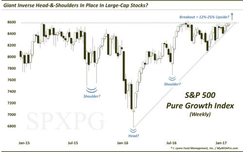
Are Large-Cap Growth Stocks Set To Surge? – January 20
While the post-August stock rally has been broad-based, the first 8 months belonged solely to large-cap growth stocks. A bullish chart pattern foreshadowed the ~25% rally in the S&P Large-Cap Pure Growth segment of the market.
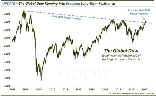
Global Stocks Breaking Decade-Long Resistance – January 27
It wasn’t just domestic stocks breaking out this year; the Global Dow Index broke above its post-2007 downtrend on its way to a 20% gain to all-time highs.
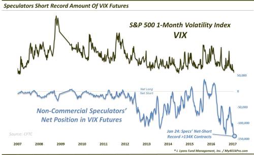
Will Record Short VIX Position Backfire On Speculators? – January 30
No…except for very brief moments. A record low year for volatility expectations prevented VIX futures Speculators’ largest net-short position in history from burning them too badly.
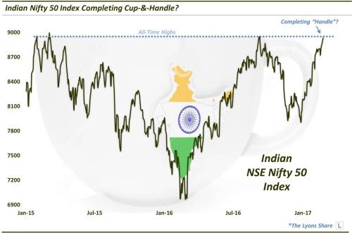
Indian Stocks In Position For Next Big Advance? – February 24
A bullish cup-&-handle formation propelled the Indian stock market to a new up-leg in its long-term bull market – and a 28% gain for 2017.
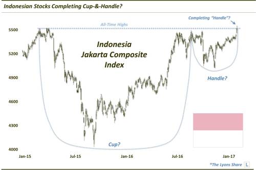
Is This Country Poised To Be The Next Big Global Breakout? (PREMIUM-UNLOCKED) – March 17
If the persistent low-volatility ascent by U.S. stocks was the story of 2017, the underrated runner-up was the re-emerging emerging markets. Among a sudden glut of attractive looking global equity markets early in the year, Indonesia stood out based on a potential cup-&-handle pattern as well. The pattern would play out by the book as Indonesian stocks have jumped by 18% to close the year at all-time highs.
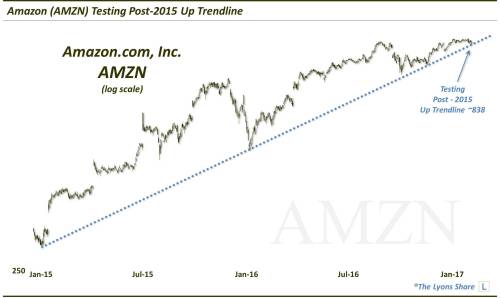
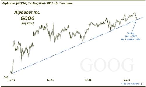
Stock Leadership Being Tested – March 28
In late March, Amazon and Alphabet – 2 important generals of the market rally – underwent similar, technical tests of their uptrends. Like every other test in recent years, these 2 leaders (and others in the tech space, e.g., Facebook, Apple, Microsoft, Nvidea, etc.) would ace the test and resume their respective ascents to over $1000.
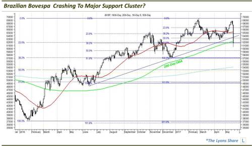
SPECIAL REPORT: Brazil Crashing (PREMIUM-UNLOCKED) – May 18
On May 18, Brazil’s stock market was sent crashing with the benchmark Bovespa Index down some 10%. That brought it right down to a key support level, however, as we noted to TLS members. The Bovespa would bottom that day – and 5 months later, it was up 25% to an all-time high.
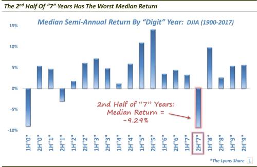
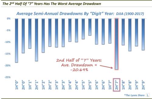
Unlucky (Year) Number 7? – July 13
With stocks near all-time highs and hitting on (almost) all cylinders heading into the 2nd half of 2017, identifying causes for immediate concern was a challenge. One candidate, though, pertained to seasonality. Specifically, we discovered that the 2nd half of years ending in “7″ historically exhibited the stock market’s worst semi-annual performance – by a lot. With a median return of -9.29% and an average drawdown of over -20%, we wondered if this historical tendency might be the thing to finally derail the stock rally. Nope. Along with every other bearish data point, the stock market rolled right over this trend, rising by double digit percentage points in the 2nd half.
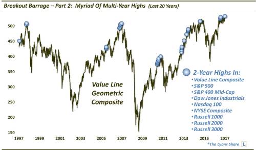
Breakout Barrage – Part 2 (PREMIUM) -July 21
In late July, a myriad of indices broke out to new highs. But, as the chart shows, the phenomenon has not always been a sure-fire bullish sign as several occurrences actually marked significant tops. In this case, while it did not lead to a major top, the breakouts did end up failing in the near-term, leading to some weakness prior to a successful breakout a few months later.
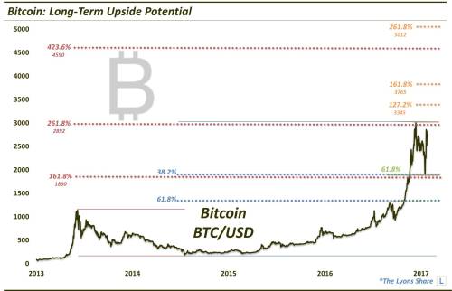
Off The Charts: Bitcoin (PREMIUM-UNLOCKED) – July 27
While the cryptocurrency craze will go down as one of the (if not THE) market stories of 2017, the phenomenon really meant very little to us. However, as we shared in late July, from a technical perspective, the chart of Bitcoin actually presented a potentially very attractive setup from the long side. Now, we were looking for, what we thought was, an aggressive “target” of a 100% rise from its 2500 price at the time. There was no way to know that the cryptocurrency would increase seven-fold to around 20,000 before the end of the year.
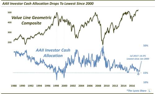
Are Investors Running Out Of Cash? – August 2
The AAII allocation survey finds the lowest investor cash position since the stock market top in 2000. At some point, this, and other longer-term “background” indicators, will have a detrimental impact on the stock market. Obviously, that point has not yet been reached.
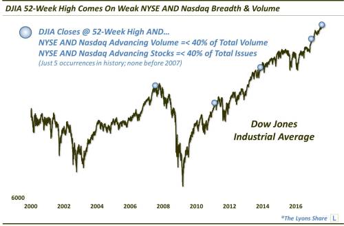
More Cracks Showing In Rally Foundation? (PREMIUM) – August 3
By late July, one legitimate concern in the stock market was the deterioration in the market internals. Despite the new highs in many indices, the majority of stocks were not keeping up. For example, for just the 5th time ever, the Dow Jones Industrial Average unbelievably hit a new high with less than 40% advancing issues and volume on both the NYSE and Nasdaq. This would lead to a temporary retrenchment, especially among the broader market, prior to a durable run to new highs.
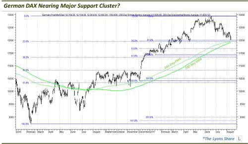
SPECIAL REPORT: Germany (PREMIUM-UNLOCKED) – August 10
While some softness in the U.S. stock market was just getting started, European equities had been dropping for several months. As we reported to TLS members, this presented an attractive opportunity in the German DAX as it had reached a substantial cluster of support levels on its chart. It would bounce immediately, rallying as much as 13% over the next 3 months.
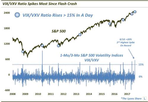
Did Volatility Traders Freak Out Enough To Bottom? (PREMIUM-UNLOCKED) – August 11
During the mid-August stock market selloff, we saw a huge spike in stock volatility expectations — but was it enough for a bottom? The answer would be a resounding “yes”. Following a bit more testing the following week, stocks would be back on their way to new highs once again.
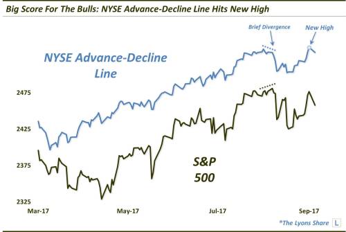
Key Indicator Signals Huge Score For Bulls (PREMIUM) – September 5
While there were assorted red flags along the way in 2017, major stock market concerns were kept at bay. This includes the September new high in the NYSE Advance-Decline Line which suggested that THE top in the S&P 500 has yet to occur.
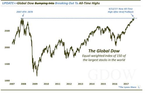
After 10-Year Wait, Global Equity Gauge Hits Record High – September 13
In the post-August rally, stock market milestones continued to register around the world, including the Global Dow Index breaking above its all-time highs set 10 years ago.
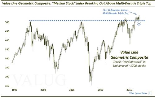
Broad Breakout For The Market Of Stocks – September 29
Among the plethora of major stock market breakouts in 2017, perhaps the biggest was the Value Line Geometric Composite, i.e., the “median stock” in the U.S. market, finally breaking above multi-decade resistance.
The Most Important Level In The Stock Market (PREMIUM-UNLOCKED) – November 9
Following its historic breakout, the Value Line Geometric Composite would return to test the vicinity of the breakout level. We deemed this level a clean and clear line in the sand delineating the business as usual “BTD” environment from one that is more vulnerable to a sharper decline. The BTD crowd would be victorious once again as the level held flawlessly, producing another impressive bounce to all-time highs.

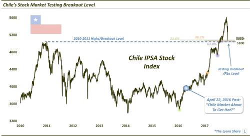
A Sweet Setup In This Hot Emerging Market (PREMIUM) – November 21
In addition to the Value Line Composite, important tests were conducted among a swathe of emerging equity markets. This included Chile, one of our favorite markets, technically, over the past few years – and maybe for years to come? In late November, Chile’s benchmark stock index tested a major confluence of support, including the former 2010-2011 all-time highs. It would pass the test in spectacular fashion, rallying as much as 7% in a day back to its October all-time highs.
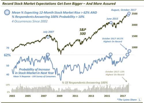
Great (Stock) Expectations – November 28
As demonstrated by the University of Michigan’s Survey of Consumers, expectations for stock market gains have never been higher, or more assured, than they are now. This is another example of a longer-term “background” indicator that hasn’t had a deleterious impact on the market – yet.
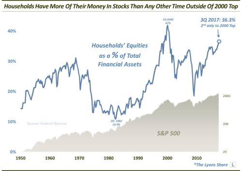
Everyone In The (Stock Market) Pool? – December 8
Yet another longer-term concern is that the percentage households’ financial assets currently invested in stocks has jumped to levels exceeded only by the 2000 bubble. Again, 2017 could care less about these background metrics – we’ll see about 2018.
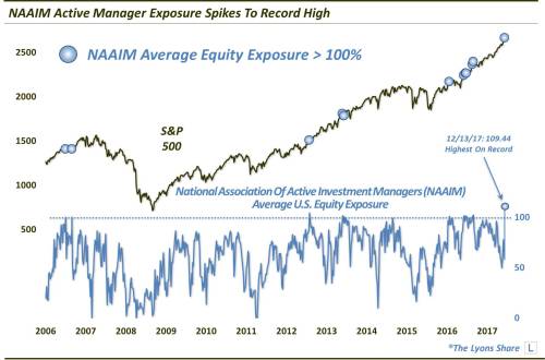
Active Managers Throw Caution To The Wind (PREMIUM-UNLOCKED) – December 15
Active investment managers also jumped aboard the rampant bullish express as demonstrated by a survey indicating their highest level of equity exposure on record. Now, to their credit, these folks have been consistently bullish for awhile. However, this recent reading suggested that, at least temporarily, there may be a few too many managers on one side of the boat.
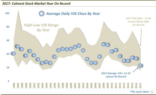
2017: A Record Smooth Ride For Stocks – December 27
2017 will be remembered for its historic volatility readings – specifically, its rock-bottom readings. That’s because, as measured by the S&P 500 Volatility Index, a.k.a., the VIX, the market has never enjoyed a less volatile year than 2017.
The 2017 Chart Of The Year:
2017: Stocks Experience Record Little Adversity – December 28
Hand-in-hand with historically low stock market volatility is a historically low level of losses. That fits the 2017 stock market to a tee and is best illustrated by our final Chart Of The Day for 2017 – and our Chart Of The Year. As it reveals, based on cumulative losses on all down days during the year, stocks endured less adversity in 2017 than any other year on record, going back more than 100 years. In fact, the paucity of losses in 2017 smashed all the historic records.
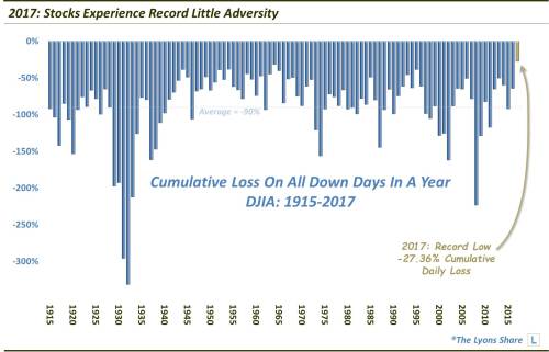
Will next year be another walk in the park for the bulls? Don’t count on it. Though, we would not have guessed that, 8 years into a bull market, we would witness its smoothest year yet. Plus, for now, it still appears to be all systems go on the current rally. At some point down the line, however, the bears will finally emerge from hibernation. And considering the alarming array of concerning, longer-term, background indicators, the reckoning may indeed be fierce.
Thank you again to everyone for reading. Here’s to another interesting and prosperous year in 2018!
What will 2018 bring? Nobody knows. But we do know that we’ll be scouring markets around the globe every day, hunting opportunities for our clients and members of our “all-access” service, The Lyons Share. Join us on the journey and find out what investments we’re looking to buy and sell – and when. Also, sign up by January 1 and save 20% off an Annual Membership during our Holiday Sale. There has never been a better time to reap the benefits of this service! Thanks for reading!
_____________
Disclaimer: JLFMI’s actual investment decisions are based on our proprietary models. The conclusions based on the study in this letter may or may not be consistent with JLFMI’s actual investment posture at any given time. Additionally, the commentary provided here is for informational purposes only and should not be taken as a recommendation to invest in any specific securities or according to any specific methodologies. Proper due diligence should be performed before investing in any investment vehicle. There is a risk of loss involved in all investments.
Thanks for the ‘picture show’ Cory. I’d bet many money managers are touting the chart of the year and the low volatility one just above it trying to show their clients why they should probably increase their exposure………