
December Sentiment Summary Covering All Markets

This article provides an interesting rundown of sentiment from “smart money” to “dumb money” and all sorts of surveys in between.I think it is important to follow investor sentiment in the markets as one gauge to determine when prices have reached a euphoric as well as hated level. Below I have outlined some of the results that caught my eye.
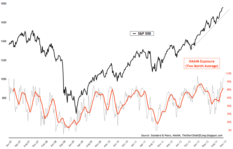
Chart 1 – Recent NAAIM survey levels came in at 101% net long exposure (meaning managers are all in and then some), while the intensity was at 213%. Dissecting the survey shows that the more bullish managers hold 163% net long positions, while the more bearish managers actually hold no net shorts as they are also 50% net long. With such an extreme net long exposure, this is yet another clear sell signal. For referencing, NAAIM survey chart can been seen by clicking here.
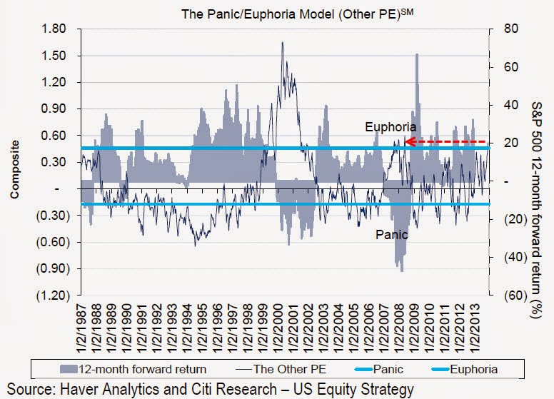
Chart 2 – Other popular sentiment surveys are also flashing sell signals. These include Consensus Inc, Market Vane Bullish Percentage, Hulbert Stock Sentiment Index, Daily Sentiment Index and so forth. Citigroup’s own sentiment index is indicating an 80% probability of negative returns in the coming 12 months (chart above). However, during vertical run ups and buying frenzies, prices can continue to rise despite such high optimism. This is usually known as euphoria and it seems we are experiencing one right now.
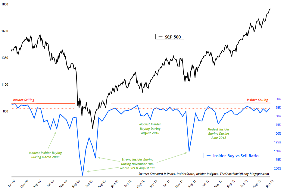
Chart 5 – Entitled “Corporate insiders continue to remain heavy net sellers” – Recent Corporate Insider reports (also known as smart money) show that net selling remains the name of the game in recent months. While there are no holly grail indicator or tool when it comes to stock market investments, I have always been a huge believer in following corporate insiders as they have access to non-public information about the company in question. Collectively as a group, they hold a much better outlook on the stock market index (as well as a much better track record) then any economists, analyst, forecaster, newsletter writer or trader. The chart above shows how well insiders have navigated the market since the Global Financial Crisis (GFC), always abiding to the old rule of buying low and selling high. Even though the market continues to rise (…for now) as they have been selling, you won’t see this group of smart money investors chase prices higher. Now, that’s discipline!
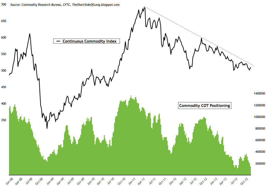
Chart 10 – Recent commitment of traders reports (also known as dumb money) showed that hedge funds and other speculators have been steadily decreasing their commodity exposure, towards previous trough in August. Cumulative net longs currently stand close to 146,000 contracts (custom COT aggregate). Almost all sub sectors saw a decrease in positioning, as hedge funds de-risk out of raw materials. Technically, the overall commodity index still remains in a downtrend, as seen in the chart above.Chart 11 – Dow Jones UBS Industrial Metals Index is currently composed of four futures contracts on industrial metals, three of which (aluminum, nickel and zinc) are traded on the London Metal Exchange (LME) and the other of which (copper) is traded on the Comex. The index remains in a downtrend for almost three years and is down close to 45% from its early 2011 peak. The chart above shows a huge build in net short positioning by hedge funds for one of its components (copper). Previous instances where short build this high occurred was during the depths of the Global Financial Crisis. Industrial metals eventually bottomed and went onto double in value.
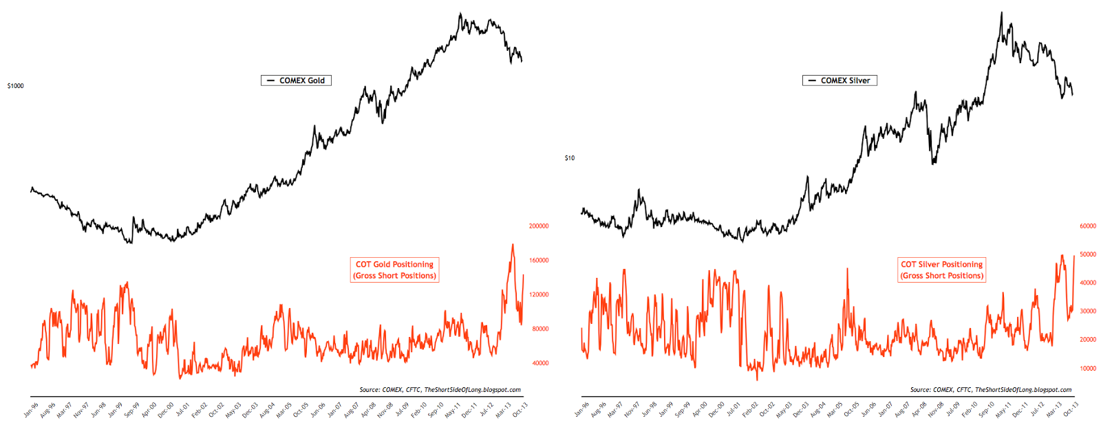
Chart 12 – Recent commitment of traders reports (also known as dumb money) showed hedge funds and other speculators have cut their net long exposure in the precious metals sector to the lowest levels since June of this year. Positioning currently stands at 26,5000 net long contracts on Gold and 6,600 net long contracts on Silver. Dissecting the report further, showed that Gold gross longs are at the lowest level since the Global Financial Crisis of 2008, while gross shorts have once again risen to extreme heights. This type of positioning also confirms the negative sentiment surveys.
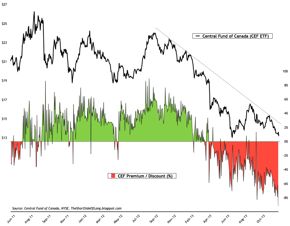
Chart 14 – With the market sentiment for precious metals sector in panic selling, traders have taken the CEF ETF price on the NY stock exchange below its actual true value almost 10% percent over the last 24 hours. In other words, Gold is being sold for $1,220 and Silver for $19.25 on the Comex, however with the discount of almost 10%, these market prices within the fund now stand at $1,100 and $17.35 per ounce. Contrarians should note that the ETF regularly shifts from premium to discount and back again. High premium levels usually, but not always, occur near intermediate peaks while high discount levels usually, but not always, occur near intermediate degree bottoms.

Chart 15 – While I covered the stocks vs bonds above, one even more interesting aspect of mis-pricing within the current financial condition is the Gold Miners sector of the stock market. Sectors such as Consumer Discretionary, Biotech, Health Care and Industrials have become overvalued throughout 2013 (with S&P 500 CAPE10 now nearing 25), one of the cheapest sectors of the market, both nominally and relatively, is the Gold Miners Index. The chart above shows a huge divergence between the two since late 2012.
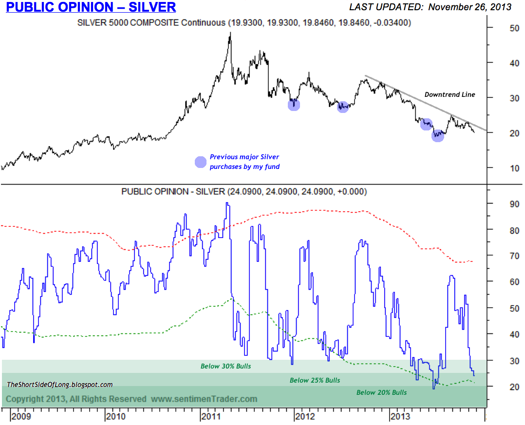
Most of the data points to a bullish trend for gold and silver as well as some other hard assets however it could still be sometime before massive amounts of money flow into the PM markets.